A/B testing. Somehow you know you need it. But have you ever thought about the actual reasons it is an absolute marketing strategy game changer?
The obvious ones are that it boosts your subscriber opt-in rate, improves conversions and skyrockets your online sales.
And we’ve only scratched the surface.
Did you know that one out of eight a/b tests has driven significant change for an organization?
If this sounds like something your business could make use of, keep reading.
What to test, how to test it, and how to analyze your results. It’s all here. And it will help you get better results, guaranteed.
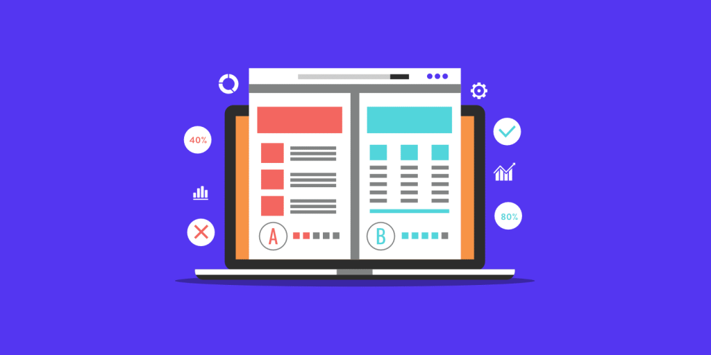
What is A/B Testing?
A/B Testing, also known as Split Testing, is an unemotional, entirely logical, coldly scientific way to compare variables in your marketing side by side, to determine which of the two variables works best.
The History of A/B Testing
The first person to successfully use A/B testing was William Sealy Gosset, who, in 1908, wanted to determine which strain of barley produced the best ale for Guinness (yay, beer!) in the over 100 years since, A/B testing has been used for everything from direct mail marketing to engineering.
But in the age of internet marketing, A/B testing has really come of age, with companies large and small tweaking the minutiae of their online presence to squeeze every drop of revenue possible from their efforts.
Why?
Because A/B testing is cheap. It’s fast.
And it’s increasingly easy to test and refine websites, apps, and email marketing messages — at least it’s faster, cheaper, and easier to modify web pages and email than it is to modify the ingredients in barrels of beer.
How does it work?
Let’s say you have a landing page with a sales offer that is currently getting 10 clicks a day. You want to see if you can improve that. You’ll use your current page as “A” — the control.
Then you’ll tweak ONE variable on that landing page — the headline, the color, or any other ONE single variable — and create a version “B” of that page.
You’ll then display the A version to half your website visitors and the B version to the other half over a specific time period — a day, a week, a month — or as long as it takes to generate a statistically relevant number of clicks.
At the end of that experiment, you’ll have cold, hard data about which version of your landing page produces more clicks — the “A” version or the “B” version.
Let’s say that the B version generates 12 clicks a day. Obviously, that represents a 20% improvement in the click-through rate. Once you know that “B” works better, you’ll use B as your Control, and move on to the next element to test.
One more example
Or let’s say you are marketing to a mailing list of 1000 people, and you want to improve your open rate.
Use your original email message as your control:
Version A. Tweak ONE variable (subject line, sender, greeting, or message) and use that message as
Version B. Send half your subscribers the Version A email, and half of them Version B.
Examine your open rates, and you’ll see the winning version — A or B. Then move on and test the next variable.
Numbers don’t lie.
Why A/B Testing?
In 2019, industry experts estimate that 1.92 billion people will buy something online. And mobile e-commerce will generate something on the order of $2.32 trillion in sales.
Want some more interesting A/B testing statistics?
According toEntrepreneur, “better UX design as a result of user testing can increase a company’s conversion rate by 400%“.
Whether you’re new to online marketing or a seasoned pro — whether you’re a small company or a giant retailer — A/B testing is the fastest, easiest, and most cost-effective way to discover how to drive more traffic, generate more leads, create more sales, and claim a bigger, smarter share of the $2.32 trillion pie.
A/B testing can give you a massive competitive advantage.
Odds are your competitors aren’t even doing A/B testing — or if they are, they’re not doing it right.
That leaves you plenty of room to learn, grow, and create content that converts like crazy in your marketplace.
So smart marketers “Always Be Testing.” If you are — or want to be — one of them, read on for everything you ever wanted to know about A/B testing.
A/B Testing Checklist
Let’s revisit the basics of online marketing to answer that question.
All online marketing starts with traffic. You have to do something (advertise) to drive traffic to your website or landing page.
Are you getting all the traffic you can?
Run A/B tests on your ads. Test your headline, copy, image, call to action, and any other element of your ad to ramp up the amount of traffic you’re getting.
Once visitors land on your page, you need to motivate them to willingly give you their contact information.
Most marketers offer some sort of lead magnet, or “ethical bribe.”
Lead magnets can be free reports, white papers, eBooks, short courses, or other valuable information you can give away in exchange for their permission to contact them.
Are you getting all the opt-ins you can?
Run A/B tests on your lead magnet, landing page, contact form, sales process, and other elements of your offer to find out.
Testing each variable will help you improve your opt-in rate because you’ll know which variable works best.
How are your open rates, click-throughs, sales?
Run A/B tests on your email campaigns.
Examine your subject line, greeting, sender, and the message itself to make sure.
Rather than frantically testing everything at once, start your testing from a rational, scientific, data-driven hypothesis.
A/B Testing Analytics
To generate a working hypothesis, you have to know your numbers. To create meaningful A/B tests, at the minimum you should track these essentials:
- Traffic: total visitors, unique visitors, repeat visitors
- Traffic Source: search, ads, referrals, social media
- Bounce rate: the amount of time visitors spend on your website before clicking away
- Conversion Rate: the number of visitors taking the action you want them to take (opting in, buying, downloading, etc.)
- Cost per lead: the cost of your campaign divided by the total number of conversions
- Lead to Close Ratio: the number of sales divided by the number of leads
10 Tips for A/B Testing Success
When you’re first starting out, the whole notion of A/B testing might get very confusing and very complicated very quickly — especially if think you have to correct everything at once.
Use these “best practices” to keep your testing clean and your results clear.
1. Test ONE hypothesis at a time
Let’s say, for example, you want to improve your conversion rate in an email campaign.
Your email directs people to the landing page for your product.
Let’s further say that you want to test both a segment of your audience and an image on your landing page to see which one converts better.
If you try to run both tests at the same time, you won’t know whether it’s the particular audience or the particular landing page image that affects your conversions.
2. Set up Control (A) and Treatment (B)
In any scientific experiment, you have to start with a “Control” — the original version of the element you’re testing (A).
From the Control version, you’ll systematically build variations or “Treatment” (B) versions of the landing page or email you want to test.
3. Determine how “statistically significant” your results should be before running your A/B test
What kind of statistical significance would make you decide to change your landing page or email campaign?
You need to know in advance what results would drive your decision to change.
If you aim at 95-99% statistical significance, you can be 95-99% sure that the difference in performance isn’t due to chance, and you can trust your decision to make the changes.
4. Test the entire landing page or email first
Before you drive yourself crazy testing a button, a color, an image, or a headline, try testing your entire landing page or email instead of testing every minor design or copy element.
Just design two different landing pages or write two different emails and test them against each other.
It’s almost a certainty that one version will outperform the other, and once you’ve identified the winner, you can start testing individual variables.
5. Test ONE variable at a time
Once you have a winning page or email, you can drill down and test the individual elements of design and copy.
Just make sure that you test only ONE variable at a time, otherwise, you’ll muddy your results.
6. Test as far down into your funnel as you can
As you proceed through various A/B tests, you will improve your conversion rates.
But don’t make conversion rates the be-all and end-all of your testing.
Look at your other metrics — how is your A/B test impacting traffic, click-throughs, leads, or sales?
In some cases, you might find that even though a version of your page or email converts fewer prospects, it generates more sales.
You’ll never know if you don’t examine the deeper elements of your funnel. (Hubspot and Kissmetrics have great tools to help you analyze your results.)
7. Test the “invisible” elements of your page or email as well as the obvious ones
When you’re looking at A/B testing, it’s easy to think about the minutiae of the visible — color, layout, font size, column placement, headline, buttons, long-versus-short copy, and so on.
But don’t shy away from testing the things that aren’t visually apparent like different target audiences, promotion timing (time of day, day of week, month, season), or alignment between an email and a landing page.
8. Test the small stuff, too
You don’t have to limit your A/B testing to major elements like headline, copy, or images.
Sometimes the tiniest changes can make the biggest difference.
Google, for example, tested over 41 different shades of blue before deciding on the most effective shade for their famous toolbar!
9. Test equal, random audiences
To make sure your results are conclusive, test two or more “equal” audiences.
For example, if you’re A/B testing an email campaign, each version of your test email needs to be sent to as similar an audience as possible.
Some factors that might cause huge differences in response rates include list source, list type, and the length of time people have been on the list.
That’s why you’ll want to make sure to split your lists randomly, keeping all the other elements of the design and timing identical.
That will get you the most conclusive results.
10. Test simultaneously
Meaningful A/B testing requires that you operate like a scientist — and that includes running your tests at the same time.
If you were to run test A one month, and test B the next, you won’t be able to determine the real cause of the different response rate. It could be as simple as the time of year.
So, whether it’s the time of day, a day of the week, or month of the year, run your tests simultaneously to eliminate time as a variable.
Now let’s look at how to apply A/B testing to the two most important elements of your online marketing efforts: your landing page or website, and your email campaigns.
How to A/B Test Your Website
There are over 1.95 BILLION websites in the world, as of January 2019, according to Internet Live Stats, with more than 300 new sites going live every single minute.
If you’re a website owner, you owe it to yourself to do whatever you can to get your voice heard in all that noise and maximize your web presence.
As your traffic online grows, even a small percentage increase in web traffic can make a massive difference to your bottom line.
Take, for example, Spreadshirt, an online marketplace where users can create and upload designs they can have printed on t-shirts, bags, and other accessories, and sell through the Spreadshirt online marketplace.
Under the leadership of a new, testing-savvy creative director, they completely revamped their website.
One of their first hypotheses was that they might increase engagement and sales by simplifying their home page, specifically their “Start Selling” call to action.
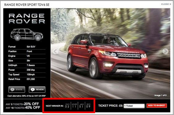
A simple test — making the call to action simpler and more prominent on the page — created a mind-blowing 606% increase in clicks and a 4% increase in orders.
Could you use a boost of over 600% in your website clicks? If so, start testing!
6 Components that Benefit from A/B Testing
It’s possible to find all kinds of research online about what works best in online marketing.
Hubspot is full of marketing statistics if you want general information or guidance.
But while general statistics like “long-form blog posts generate 9 times more leads than short-form” or “organic traffic improves 157% with videos” might suggest that you immediately write longer copy or add video to your site, keep in mind that those statistics are general.
They might not apply to your business or your audience.
Your audience is unique to you.
Your audience might like video…or they might hate it.
Your audience might want to see a 200-word bullet-pointed blog post they can skim…or they might want a 5000-word post they can curl up on the couch with.
The only way you’re going to be able to provide the kind of online experience to your target market is yearning for is to test, test, and test.
1. Design
Even minor design changes can drastically influence customer behavior, as Google found in its “41 Shades of Blue” experiment.
While A/B testing every detail of design might seem like a huge waste of time and energy, even the tiniest improvement in click-through rates can represent more money as your website traffic grows.
Think about it this way: Visuals play a huge part in a customer’s decision to engage or buy.
As a matter of fact, JLB Media reports that 9 in 10 shoppers say visuals are the most important factor in their buying decisions.
So, the way your website or landing page looks will make all the difference in how your visitors experience and engage with it.
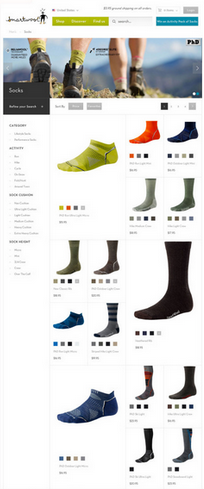
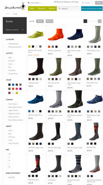
Here are some of the design elements you might want to test on your website or landing page and here are some landing page examples:
- Layout
- 1, 2, 3 columns or more
- Navigation links and location – top versus left column versus right column
- Typography
- Style
- Size
- Color
- Colors
- Background color
- Font colors
- Navigation link/toolbar colors
- Images
- Featured image
- Header image
- Background image
- Rotating images
2. Content
Your website visitors have come to you for a specific answer to a specific problem.
Their needs should drive your content.
For example, if your target audience includes senior-level executives, a short, bullet-point article with links might work better than a half-hour video.
If, on the other hand, your audience is highly technical, they will probably respond better to longer copy with plenty of data and statistics.
Tailor your content to how much your audience already knows, how much they need to be educated, and how interested they are, according to your own specific marketing plan.
Test these elements:
- Headlines
- Text
- Short-form vs long-form copy
- Video vs Audio vs Text vs Slide Show
3. Contact Form
Don’t make it difficult for your visitor to opt-in by asking for too much information. A general rule of thumb for contact forms is “less is more.”
But consider testing:
- Number of fields
- Text link vs button to “submit”
- Location on the page
4. Call to Action
What, specifically, do you want your visitor to do? How much information do you need to provide them so they’re ready to take that action? Your call to action needs to be straightforward.
But do test:
- Position – “above the fold” vs “below the fold”
- Color
- Wording
5. Pricing
Test the best option for pricing your product or service.
Will you offer a free trial? Will you offer a one-time-only gift with purchase? Should you offer “decoy” or limited time only pricing?
Test:
- Free trial
- Length of trial
- Guarantee
- “Decoy” pricing
6. Steps to Complete Order
Put yourself in your website visitor’s place and examine your entire funnel process from his or her point of view.
Make it as easy and seamless as you can for them to do business with you.
Jumio reports that “While the majority of smartphone and tablet owners (68%) have attempted to make a purchase on their device, two-thirds (66%) failed to complete a transaction due to obstacles encountered during checkout.”
And StreetInsider further estimates that “Cart abandonment accounts for $24 billion in sales losses each year.”
You will want to test:
- Number of steps to order
- Shipping costs
- Barrier to qualify for free shipping
- Payment methods
As you can see, A/B testing your landing page or website could be a challenging process. Setting up the test, managing the details, and gathering and analyzing the data might seem overwhelming.
It doesn’t have to be. There are plenty of great website A/B testing tools with price tags ranging from free to tens of thousands of dollars.
Depending on the size of your company, your budget, your staff, and the time you have available, the recommendations below can help you streamline the whole A/B testing process.
5 Great A/B Testing Tools for Websites
1. Google Analytics
Google Analytics forms the baseline for any data analysis on the internet.
You can connect your website to Google Analytics, and start collecting invaluable data about its performance within minutes.
You can set and track conversion goals and set up quick, efficient A/B tests that Google calls “Experiments.”
You’ll be able to easily find your website’s bounce rate and analyze statistics that show you how visitors are behaving and interacting with your site.
The good news is it’s free to anybody with a website.
The bad news is you’ll face a steep learning curve as you will have to interpret the raw data yourself. Luckily, it’s fairly intuitive to get up and running.
2. Optimizely
If you’ve never done data analysis yourself and want to start A/B testing your site, Optimizely is one of the best choices you can make.
It’s simple to install, has a low-cost entry point, and features a fantastic, highly-intuitive user interface.
You can also add features and functionality as your budget grows.
Optimizely features a specialized tool that allows you to take two (or more) variations of pages on your website and compare them side-by-side to see which performs better.
With just this tool, you can easily increase visitor engagement and conversions, and make numerous changes to your landing pages without having to dig around in your code.
3. Visual Website Optimizer (VWO)
A little pricier than Optimizely, VWO is gaining in popularity as a full-featured suite of testing tools aimed at improving conversions.
Like Optimizely, they offer a very simple, intuitive interface, but feature a whole lot more options that you can use as little or as much as you like.
Their platform is based on a logical, 5-step system: Track, Analyze, Plan, Test, and Target.
Users are systematically guided through the process by the interface. One of the features that make VWO so popular is its highly intuitive funnel analysis system that allows you to track data deep within your own funnel and see where you might be losing leads.
This tool shows you where you need to focus your A/B conversion testing first.
The testing dashboard is visual, so you can make any changes to your landing page easily by selecting and changing the element you want to test within seconds.
When you’re finished, VWO will create all the possible combinations of those changes and help you choose the best option.
That way you can run a full round of testing on one single element –without having to change it manually every single time.
4. Unbounce
Unbounce has cornered a very specific niche in the A/B testing world.
They only work with landing pages. That’s it.
Well, that and simple, basic A/B testing. And they’ve mastered the art of creating and testing high-converting landing pages.
What that means is that Unbounce is a very basic, tightly focused tool.
You can literally create and publish conversion-optimized landing pages in just a few hours, using Unbounce’s more than 80 pre-tested templates that you can customize for your brand.
If you’re just beginning your online marketing adventure and are looking for fast results, this is a great tool to create and start A/B testing your landing pages at a very reasonable cost.
5. Kissmetrics
Perhaps one of the most robust, data-driven, insightful testing software on the internet, Kissmetrics has been around a while.
Its A/B tester allows you to create experiments and evaluate the results so you can achieve conversion goals throughout the depth of your website.
Almost as robust as Google Analytics, Kissmetrics is much simpler and more intuitive to use. It’s also one of the more expensive options.
You can start by A/B testing conversions from page views, and then drill down through subscriptions and sales, exploring and improving every element of your sales funnel.
But one of the standout features of Kissmetrics is their ability to store the historical details of every single visitor to your website, tracking their behavior, and giving you insight into who they are and what they want from your site.
Knowing who they are and what they want allows you to create custom populations for your website testing.
Okay.
So now you’ve got a fully tested, high-functioning landing page that’s getting tons of opt-ins. It’s time for the follow-up email.
And guess what?
You’re going to have to test that, too.
How to A/B Test Your Email Campaigns
According to the Radicati Group, over 3.8 BILLION emails are sent every day, 333 BILLION emails will zip around the internet.
And according to the same Group, the average office worker gets something approaching 121 emails every day (while only sending 40).
Nearly half of those billions of emails (49.7%) is considered spam.
Given that nearly half of the email out there is considered spam, and 2.3% of the worldwide email contains some sort of malicious attachment, is it any wonder that the average open rate for marketing emails (in North America) is 13.7% on mobiles, and 18% on desktops.
What’s a marketer to do?
Easy. Improve your open and click-through rates by A/B testing every email campaign you send.
A/B testing will help you identify and address the needs particular to your audience, and what works best in talking to them.
The more you test, the more you’ll be able to uniquely position your business to address those specific needs.
Over time, you’ll be able to create custom-tailored email campaigns that precisely target your prospects and generate much more engagement.
In other words, A/B tests will save you time and money as you identify the precise elements that help your business succeed.
But again, just like with your landing page, you need to know your numbers before leaping into A/B testing, so you’ll know what you’re measuring against.
For email A/B testing, you need to know:
- Open rate
- Click-through rate
- Response Rate
- Subsequent Conversion Rate
The email campaign software or platform you use should help you analyze those numbers.
Email A/B Testing Best Practices
- Begin with a specific goal in mind. Do you want to improve your open rate? Your click-throughs? Your response rates? Or your conversions down the line? Testing is meaningless without measurement.
- Use a large enough sample to make sure your results are statistically significant.
- Randomize your sample groups.
- Test before you launch the entire campaign, so you’ll have time to analyze and interpret your results or make any changes before you send it to your entire list.
- Test often — test every campaign.
- Identify each variable you want to study and test them one at a time.
- First, consider testing two completely different emails against each other to get a feel for the kind of content your audience prefers. Then drill down and test the variables.
The 4 Email Campaign Elements You Should Test
1. Subject Line
Typically, you only have 30 characters to catch your reader’s eye with your subject line. The optimal length should be between 60-70 characters. Finding the right subject line through testing could make the difference between 200 people or 2000 people opening your email.
The ONLY purpose of your subject line is to get your reader to open the email. Some other subject line considerations to test include:
- Which tone works best, a neutral and businesslike, friendly and intimate, or provocative and shocking?
- Does rearranging the words in my subject line make a difference in my open rates?
- Will a long or short subject line work best for my subscribers?
- Does including a number in the subject line improve my open rates?
- Does using the recipient’s name in the subject line work for my audience? (On mobile devices emails with a personalized subject line are 25% more likely to be opened. Your mileage may vary.)
- Will my subject line work better as a question or as a statement?
2. Campaign Content
If the purpose of the subject line is to get your readers to open the email, your first line of copy should give them a reason to keep reading and engaging with your content.
You’ll want to test components of your copy content including:
- Should I use long-form copy or short copy?
- Should I use an image in my email? Which performs better, a message without a visual, or the same message with a visual? Should I use one visual element or many?
- What colors create better open rates?
- Does the font type, size, or color influence my open rates?
- How does the way my content is spaced impact open rates?
- Does one email template outperform another?
- Does a button work as the call to action to link to my landing page? Or does a text link work better?
3. Campaign Sender
Depending on your product or service, the sender of your email might influence your open rates.
Would your audience prefer to get a message from, for example, Bill Gates? Or from Microsoft? From Jeff Bezos? Or from Amazon. Elon Musk? Or SpaceX? Test it.
- Should I send the email as a person?
- Should I send the email as a company?
4. Timing
The internet is crawling with studies about “the best time to send emails.”
But you won’t know for certain whether those general recommendations apply to your company and your audience.
The only way to discover when your subscribers are free from distraction and more likely to open your emails is to test.
Once you uncover your best timing through A/B testing you’ll be better able to motivate them and get them to take action.
You’re going to want to test the best:
- Time of day
- Day of week
- Time of month
- Season of year/holidays
6 Great Email A/B Testing Tools
Just like testing your landing page or website, AB testing your email campaigns might seem complex and confusing.
It doesn’t have to be. There are lots of email campaign services available, and, luckily, most of them offer A/B testing as part of their plan.
Here are just a few recommendations:
1. Moosend
Moosend has everything you need to easily automate — and A/B test — your email marketing campaigns, whether it’s a newsletter, a customer onboarding letter, or a drip-feed series.
Moosend’s platform features effortless and flawless email design, user-friendly list management, state-of-the-art automation, and reliable analytics.
You can automate on the go, design your own automation workflows, and sync up your data without restrictions.
Instead of offering a limited-time free trial, Moosend offers all its robust email services free — forever — as long as your list is fewer than 1000 subscribers.
As your list grows, you’ll pay a bit more, either by a monthly fee starting at $10 for more than 1000 subscribers.
You can also “pay as you go,” if your list size changes.
2. AWeber
A full-service email and contact management service, AWeber features simple, easy-to-use tools to create email campaigns and related opt-in forms to manage all aspects of email marketing.
Starting from a 30-day free trial (during which your emails will contain an AWeber watermark), AWeber’s pricing starts at $19 per month for up to 500 subscribers and ranges up to $149 per month for up to 25,000 subscribers. A/B testing, or Split Testing is just one feature of their service.
3. Infusionsoft
Infusionsoft is a monster of a contact and business management platform that allows you to organize your sales, marketing, and customer information all in one place.
Of the tools available for email campaign management, it’s one of the most expensive.
For established businesses with sophisticated marketing needs, prices start at $199/month for list sizes up to 2500 subscribers, and range in excess of $399/month and up as your subscriber base grows.
With a simple, intuitive drag-and-drop interface, you can create marketing campaigns using their ready-made templates.
You can also build landing pages from optimized, industry-specific templates and A/B test everything to improve conversions.
4. GetResponse
GetResponse offers more than just email campaign management.
Calling itself an “All-In-One” marketing platform, GetResponse provides tools and resources for not only email management but also landing pages, webinars, audience behavior tracking and more.
Offering a free 30-day trial (with restrictions), prices start at $15 per month for email marketing and landing page tools for lists up to 1000 for one user account.
Prices range up to $1199 per month full-service plan for lists up to 100,000 subscribers and 10 user accounts.
GetResponse allows A/B testing on emails, ads, webinars, landing pages, and all funnel elements in between.
5. Constant Contact
Like most other contact management/email marketing software, Constant Contact begins with a two-month free trial and offers tiered pricing for a full-service email-management-only platform.
While plans start at $20 per month, the least expensive way to get A/B testing is by spending $45 per month (depending on your list size, it could be more).
Constant Contact does, offer, however, customizable email templates optimized for mobile email, as well as all the metrics, analysis, and reporting you might need.
6. MailChimp
MailChimp is a robust online marketing platform that allows you to start marketing from ground zero.
It offers you the ability to create landing pages, popups, and Facebook and Instagram ads, with more services available as your subscriber base increases.
You can use the basics of Mail Chimp free for up to 2000 subscribers, but your emails will be sent with MailChimp’s logo and branded text.
Tiered pricing starts at $10 per month and ranges upwards of $199 per month, based on your list size.
A/B testing is included in the free plan, so if you’re just getting started at email marketing, Mail Chimp offers a reasonable entry price point — free — if you’re willing to send emails out with their logo and branded text.
Here are also some Mailchimp alternatives to consider.
A/B Testing Examples
While most marketers know A/B testing should be a regular practice, many don’t know what to test. I’ll bet you’ve seen case studies that say changing one word on your CTA can increase conversions by 76%. But as you may know, A/B tests aren’t one size fits all and what works for some may not work for others.
In this article, I’ll show you 50 A/B testing examples and case studies to help you with your tests. I’ve shown the main points and how these individuals or companies got great results.
Let’s get started.
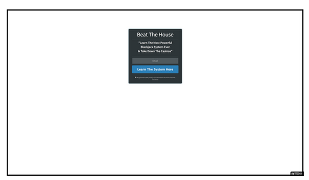
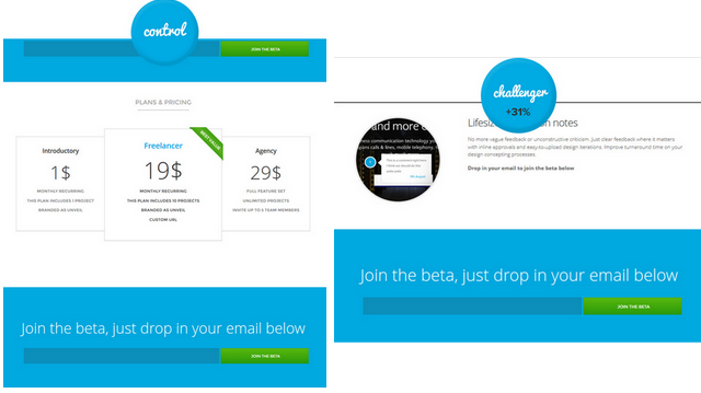
1. Adding FAQ, social proof and statistics increases conversions by 11.5%
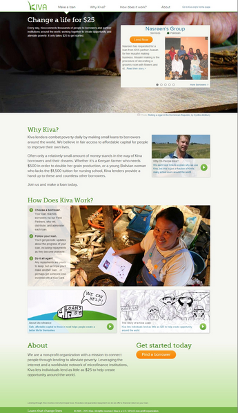
Kiva, an innovative non-profit organization, wanted to increase the number of donations of first time visitors to their landing page.
Hypothesis: Kiva believed that if they provided more information for visitors on their landing page that they’d increase the number of donors.
Result: Adding an information box to the bottom of the page resulted in an 11.5% increase in donations.
Version A – original:
Version B – Addition of information box (FAQ, social proof & statistics) – Winner:
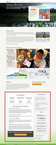
What these split test results mean:
You always need to make sure you answer any objections a visitor to your landing page will have. The additional information at the bottom helped clarify objections and increase credibility as an organization.
2. Changing the subject line of an email increased Click Through Rate (CTR) by 2.57%
A large retailer sent out an email blast to its list just days before Christmas to encourage people to browse their collection.
Hypothesis: They wanted to see which subject line would get the most click-throughs. They were testing between “Merry Christmas,” “Happy Holidays” or a combination of the two in the subject line.
Result: “Merry Christmas” had 2.57% higher CTR than the next closest competitor.
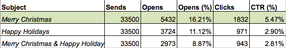
What These Split Test Results Mean:
If your emails aren’t being opened it doesn’t matter what your offer is, no one will see it.
3. A personalized banner ad increases CTR by 6%
Sony wasn’t achieving the conversion rates they wanted from their banner ads. Originally, the ad featured two calls-to-action, “Make it personal” and “Customize your VAIO.”
Hypothesis: Sony wanted to test if either the personalized or promotional ad would convert better.
Result: The personalized call-to-action increased click-through rate by 6% and shopping cart adds by 21.3% over the original.
Control/Original (Dual CTA):

Version A – Personalization – Winner:

Version 2 – Promotion:

What these split test results mean:
Version A worked so well because it personalized their message. Sony used the word “your,” but “my” would also work. You just need to see which one works best for your customers.
4. Changing the copy of the Facebook Ad increases Facebook likes from 0 to 70!
Adspresso wanted to increase the number of likes on their Facebook page. They ran two Facebook ads to see which one would result in a higher number of likes.
Hypothesis: Keeping everything else the same they just changed the copy on their ads (see below.)
Result: Version A “LIKE us for pro tips on how to improve your Facebook ad campaigns today!” resulted in 70 Facebook likes. Version B didn’t even get 1 like.
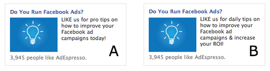
What these split test results mean:
From the first line, you can see why Version B did so poorly (not even getting 1 like.) People don’t like being spammed. Telling them that they’ll be getting a daily tip is basically warning them that they’ll have to sift through emails to find useful information.

5. A more clear and direct call-to-action increases clicks by 49%
Fab is an online retail community whose members can buy and sell apparel, home goods, accessories, collectibles etc. The majority of people who add items to their cart do it directly from the catalog pages.
Hypothesis: Fab wanted to see if they could increase cart adds by making the “Add To Cart” button clearer.
Result: Spelling out “Add To Cart” increased cart adds by 49% over the original.
The original design (on the far left) features a small shopping cart with a “+” sign and no text. The two versions (middle and right) added text based designs. Version A “Add To Cart” was the winner and helped increase cart adds by 49% over the original.
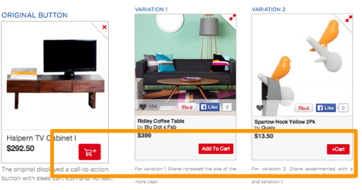
What these split test results mean:
Having a clear and direct call-to-action will help customers know why they should click. If you have an unclear CTA your visitors won’t know what the button does.
6. Replacing a guarantee with a trust symbol increased conversions by 107%
ExpressWatches is an online dealer of Seiko watches. They were looking to increase the amount of customers who buy their watches online. They found that a major problem consumers have when purchasing online is whether a product is authentic or not.
Hypothesis: They wanted to try replacing the price guarantee with a trust symbol to see if more people would purchase.
Result: The replacement of the price guarantee with a trust symbol increased sales by 107%.
Version A (Guarantee):
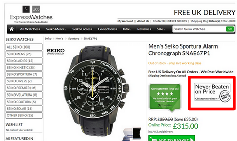
Version B (Trust Symbol) – Winner:
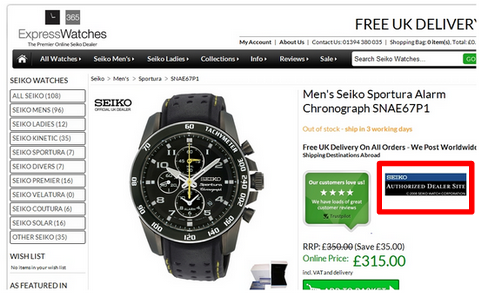
What these split test results mean:
You need to figure out what’s most important to your customers not just what you think is. ExpressWatch customers cared more about the authenticity of the watch than the price.
7. Replacing an image with a video increases conversions by 12.62%
Growyourowngroceries.com teaches people how to “grow healthy food in your own backyard” through a set of DVDs. The owner, Marjory Wildcraft was looking to increase the amount of sales on their DVDs. The original landing page featured an “About me” section that had a description of the owner and a friendly picture.
Hypothesis: Marjory hypothesized that if she replaced a photo of herself with a video that sales would increase.
Results: The video helped increased conversions by 12.62%.
What these split test results mean:
A video on a sales landing page instead of a photo can drastically improve conversions. Video’s can be more engaging than a photo and give you an extended period of time with a visitor. This gives you the chance to provide more details, clear up any questions and make a personal connection.
8. Using an image instead of a blank background resulted in a 7.46% higher conversion rate
A company wanted to know whether they should leave their background blank or use a photo.
Hypothesis: They split tested a photo background page against a blank background page.
Result: The photo background page had a 25.14% conversion rate compared to 17.68% for the one with no photo.
Version A – Image – Winner:
Version B – Blank Background:
What these split test results mean:
Having an image of the product helps drive visitors towards conversion. This is so they have a way to visualize what they’ll be getting.
9. Showing an image with a desired outcome increases signups by 89%
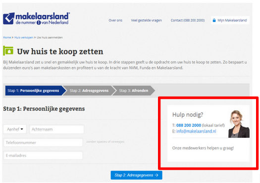
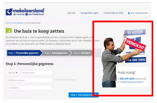
Prospective home sellers can register to post their home listings with Makelaarsand. Registering is a three-step process and if help is needed there’s a “help” option to the right of the form.
Hypothesis: Makelaarsand wanted to see if more people would sign up if a different image was used in the help section.
Results: Changing the picture from a smiling female to a male placing a “sold” sticker on a “for sale” sign increased signups by 89%.
Version A – Smiling female:
Version B – Man with “sold” sticker – Winner:
What these split test results mean:
- The second picture worked well because it showed prospective clients the desired outcome. It conveys the message, “if you sign up with us, you will sell your home.”
- Persuasion tactics when used in the right place will help sell your product. You just need to find the one that works best for you.
10. Adding the incentive of free shipping increases orders by 90%
NuFACE is an anti-aging skin company that was looking to boost their online presence and ultimately sales. They found that their potential customers were holding back on purchasing even though they were interested.
Hypothesis: They wanted to test if offering an incentive (free shipping) to all orders over $75 would increase conversions.
Result: Adding free shipping increased orders by 90% and the average order value (AOV) by 7.32%.
Version A – No free shipping:

Version B – “Free Shipping Over $75!” – Winner:

What these split test results mean:
- Offering potential customers an incentive to buy increases the likelihood of them buying now.
- Lack of free shipping is one of the top reasons for shopping cart abandonment. If you provide this incentive then you not only increase the likelihood of someone purchasing but also the Average Order Value.
11. Sales increased by 17.1% when best practices for product pages was used
SmartWool wanted to increase the average revenue per visitor on their product page.
Hypothesis: They wanted to see whether changing the design on their products page would increase the average revenue per visitor.
Result: Using best practices of product pages (Version B) increased average revenue per visitor by 17.1%.
Version A : Uneven and mismatched, this product pages features its products in different sizes and on different levels.
Version B – Winner: This page used best practices of product pages with each product being the same size and on the same level.
What these split test results mean:
- It’s important to be creative on your website. However, creativity shouldn’t necessarily be focused on your products page. A messy product page makes it harder for visitors to view your product and therefore harder to purchase.
- There’s a reason why certain layouts are used, they convert better! Stick with best practices instead of trying to be too fancy.
12. Changing the copy in one bullet point lifts conversions by 18.59%
Michael Aagaard wanted to get more to people to download his ebook by saying how long it would take to read.
Hypothesis: He thought that time was a major barrier for visitors to download his ebook. Keeping everything else constant he simply changed the copy of a single bullet point.
Result: Changing the copy of a single bullet point increased conversions by 18.59%.
Version A
“Insights and experience from 4 years of research and over 350 A/B tests distilled into one 26-page free ebook”
Version B
“Read the book in just 25 minutes and get insights from 4 years of research and over 350 A/B tests”
What these split test results mean:
You need to determine barriers of conversion for your prospective customer. In this case, letting visitors know the exact time the ebook would take to read increased conversions.
13. Changing placement of testimonials increased downloads by 64.53%
Michael Aagaard knew the importance of having customer testimonials on his downloads page.
Hypothesis: He wanted to see if conversions would increase by changing the placement of the testimonials.
Result: Breaking up the testimonials into sections (two above and two below the CTA) increased conversions by 64.53%.
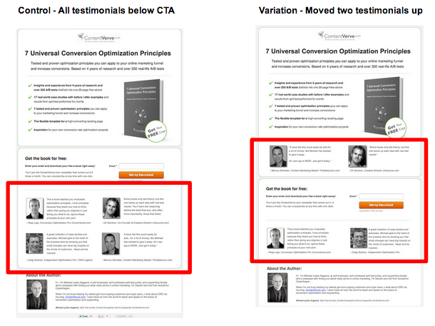
What these split test results mean:
Moving two of the testimonials above the call-to-action increased conversions because more visitors were seeing them. If the visitor didn’t scroll down the original page visitor wouldn’t have seen them.
14. Mobile-friendly landing page increases leads by 256%
Rasmussen College was looking to increase leads from Pay-Per-Click traffic on their mobile site.
Hypothesis: Creating a newly designed for mobile site featuring a click-through menu would get more conversions than a responsive site.
Result: The new mobile-only site increased conversions by 256%.
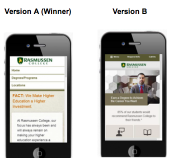
What these split test results mean:
Mobile responsive sites are better than unresponsive sites. However, if you want the highest conversion on mobile it needs to be redesigned for optimal mobile use. You can do this by simplifying the page and taking away unnecessary items which will reduce load time. Adding a drop down menu will also help with navigation.
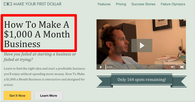
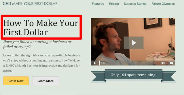
15. Change in headline increases sales by 6.49%
Monthly 1K wanted to increase the amount visitors purchasing their online courses.
Hypothesis: They wanted to see if changing the headline on their landing page would increase conversions.
Result: “How to Make a $1000 a Month Business” increased sales of their $300 course by 6.49%.
Version A – Winner:
Version B:
What these split test results mean:
Providing an actual dollar amount resulted in a higher conversion rate. Visitors were able to visualize themselves making a dollar amount rather than just their first dollar. Whenever possible showcase the value of your products.
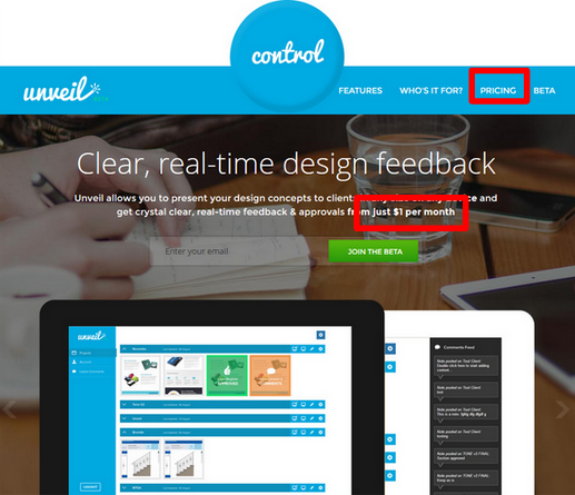
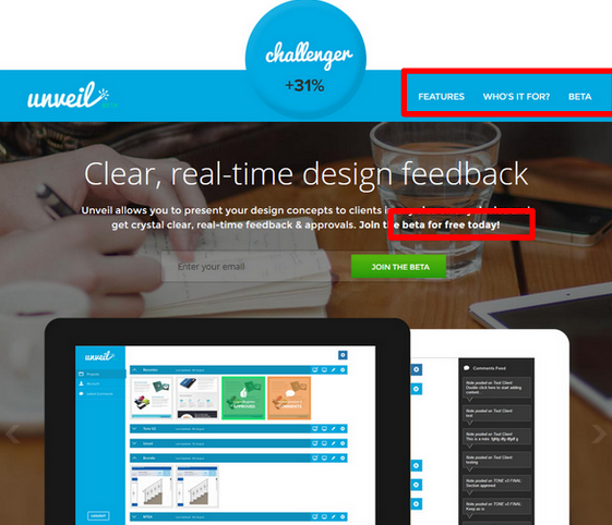
16. Removing reference to pricing increased signups by 31%
Unveil was trying to generate as many leads as possible for beta testing their new application.
Hypothesis: They wanted to test whether eliminating reference to pricing and clearly stating it’s free would increase signups.
Result: By removing any mention of pricing from their website they were able to increase their signups by 31%.
On the top part of the page they changed two things. They removed the “pricing” option in the menu and changed “from just $1 per month” to “free”.
Version A:
Version B:
Version A (right) Version B (left) – bottom of page:
What these split test results mean:
Determining the right price point for your target audience is important. Try testing different price points to see which one works best for your business.
17. Conveying a clear message increased sales by 40.81%
Underwater Audio wanted to redesign their website to increase sales.
Hypothesis: They wanted to test whether improving the copy and design of their information section would increase sales.
Result: The updated information section increased sales by 40.81%.
Version A:
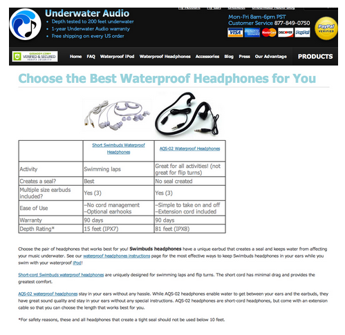
Version B – Winner:
What these split test results mean:
The biggest improvement I saw in this section was the copy. In Version A they state you can wear the headphones for “Most Activities.” I like that in Version B they list the types of activities you can do. By giving me some clear options I can imagine myself swimming with these headphones in.
18. How placing ads on content pages helped increase engagement by 104.99%
Bakker-hillegom is an online store specializing in products and information related to gardening. Because of their niche and relevant content they were able to attract a large number of unique visitors to their website. The problem they were finding was that the visits weren’t turning into sales.
Hypothesis: They decided to test if adding promotional banners to each content page would increase engagement on the site.
Result: Adding banners to the top of each page increased traffic to the sales page by 105%.

What these split test results mean:
If visitors don’t know what you sell they won’t be able to buy it.
19. Additional information near CTA increases action by 24%
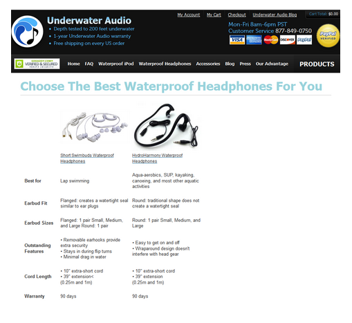
Overtoom, a large mail order company, wanted to increase conversions.
Hypothesis: They thought that adding a trust symbol, incentive to buy and offering different payment options would increase basket adds.
Result : Adding these three elements below the CTA increased sales by 24%.
They took the original order form and added three elements close to the CTA:
- Trust – Added a star rating from customers
- Incentive – Free delivery on orders over 200 Euros
- Options to pay – Invoice, Visa or Mastercard
What these split test results mean:
Each element worked together to push the customer to add something to the cart.
- They assured the customer – through high star ratings – that it’s a good product to buy.
- Increased Average Order Value (AOV) with free shipping.
- Gave a final push with multiple payment options.
20. Change in subject line increases open rate on emails
Spicerhaart knew that their email marketing was only effective if people were opening their emails.
Hypothesis : They felt that if they changed the way the subject line was presented that more people would open.
Result: Splitting the subject line into three easily readable sections increased open rates by 74%.
Version A : Mill View | Join us for our pre-launch weekend to find out more about these exciting new homes
Variation B (Winner) : Mill View | Pre-launch weekend | Quality homes affordably priced
What these split test results mean:
Your subject line is the most important element in email marketing. If no one opens your email it doesn’t matter what the content inside is.
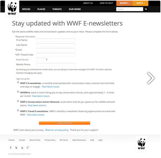
21. Cleaned up registration page lead to more newsletter sign-ups
The World Wildlife Fund wanted to increase the number of registrants for their newsletter.
Hypothesis: Redesigning and adding a photo would increase the number of registrants.
Result: Changing the layout and adding a photo increased registrants by 83%.
Version A:
Version B – Winner:
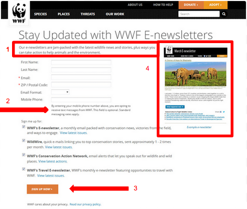
They changed these 4 elements:
- Gave information about what to expect.
- Moved the text right to make it easier to read.
- Moved CTA to the left to align with the form.
- Added a picture showing the layout of the newsletter.
What these split test results mean:
Cleaning up the page made it easier for visitors to register. The example was a great addition as visitors knew what they’d be receiving for their efforts.
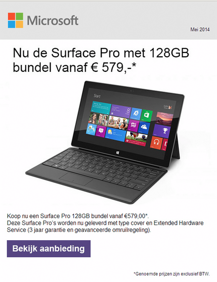
22. Increase your email clicks by 325% with a sleek design
Microsoft was looking to increase the amount of people clicking through on their emails.
Hypothesis: Changing the color scheme would increase click throughs.
Result: Version A increased click-throughs by 325%.
Version A (White Background, Full Product Image, Purple CTA) – Winner:
Version B (Orange Background, Cropped Product Image, Pink CTA):
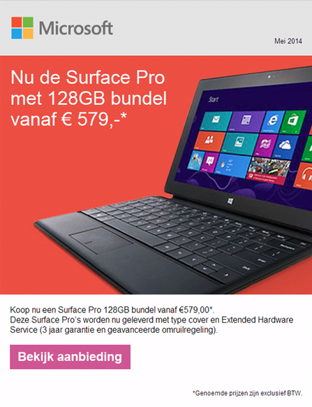
What these split test results mean:
Despite Version B following the color scheme of Microsoft’s online marketing, Version A won. Version A made it easier to find where you were supposed to click. The contrast of the purple CTA against the white background draws your eye immediately.
23. Personalized abandonment subject line for email increases opens by 31%
Raileasy, an online travel booking company, wanted to increase the amount of people returning to purchase a product.
Hypothesis: They felt that if they changed the subject line they could increase re-engagement.
Result: A personalized subject line increased open rates by 31% and overall sales by 38%.
Version A (Winner) – Personalized Subject Line: “Still looking for tickets to [destination]?”
This helped the visitor remember why they were searching the destination in the first place.
Version B – Generic Subject Line: “Haven’t found what you are looking for?”
This was far more generic and could have been related to anything.
What these split test results mean:
Abandonment issues are one of the main concerns of ecommerce stores. Having an effective cart abandonment follow-up plan (like Raileasy) is key to increasing sales.
24. Change in design of social proof generates leads 69% better than original
comScore was looking to generate more leads from their website.
Hypothesis : They already had social proof on their website. They felt that by changing the design of their proof they’d generate more leads.
Result: Social proof in a vertical layout with logo (Version 1 below) generated leads 69% better than the original.
Original version (Social proof in a grey box with no logo)
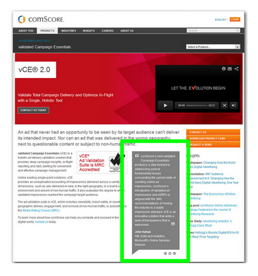
Multivariate testing was conducted.
- Version 1 (Logo on top/Vertical design) Winner!
- Variation 2 (No Logo/Horizontal design)
- Variation 3 (Logo on right/Horizontal)
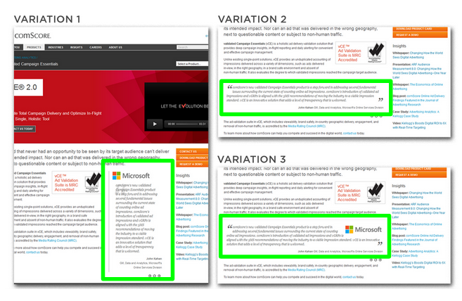
What these split test results mean:
Social proof is extremely important to online marketing. It’s not going to mean much if people think its fake or it’s hard to find.
25. Redesign increases interactions by 606%
Spreadshirt wanted to increase the amount of visitors who became sellers on their website.
Hypothesis: Changing the “how to” section of their website to make it easier to understand would increase conversions.
Result: Reducing the amount of text, graphics and calls-to-action made the “how to” section clearer. This increased conversions by 606%.
Version A (Original):
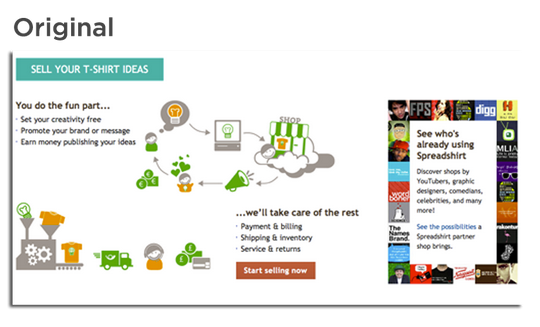
Version B (Winner):

What these split test results mean:
Version B is way easier to follow. It shows very clearly the process (with arrows) of how to use their website.
26. Redesign of mobile homepage increases user activity by 235%
Runkeeper is a mobile application that allows users to log their exercise activities. They wanted to expand the types of activities people logged.
Hypothesis: They felt that if they clearly showed each activity available then people would be more likely to log them.
Result: Showing each activity available on the home screen increased logged non-running activities by 235%.
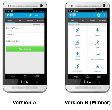
What These Split Test Results Mean:
You need to design with the user in mind. It’s much easier to just choose a clearly-available option than search for it.
27. Increased conversion by 7.3% by offering free returns
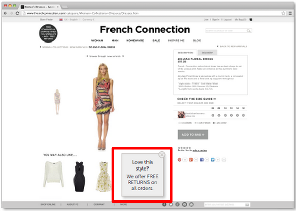
The French Connection ecommerce store wanted to increase their online sales. They found that price was a major concern for visitors to their website. They already offered free shipping on orders over £75.
Hypothesis: They felt that if they added free returns (the statement “Love this style? We offer FREE RETURNS on all orders”) would make people more comfortable purchasing.
Result: Adding a guarantee on products increased conversions by 7.3%.
28. Weather targeting increases conversions by 11.6%
Burton wanted to increase their online sales. They wanted to do this by personalizing the shopping experience for each visitor.
Hypothesis: Showing personalized results based on weather targeting would increase conversions.
Result : Weather targeting shoppers increased conversions by 11.6%.
This is how the page would look if it was snowing and cold:

If its sunny they’d show shades and shorts.
If it’s rainy they’d show jackets and rain boots.
What These Split Test Results Mean: You want to try and personalize your results for each customer as best as you can. Although weather targeting is complex you could do something simple like gender to give your customers a more unique experience.
29. A responsive search bar increases transactions by 12%
alittlemarket.com sells handmade french creations. They wanted to increase the amount of purchasing customers.
Hypothesis: They wanted to optimize the search bar. Now, instead of having to select options and hit “filter”, the bar would automatically filter.
Result: Responsive search results increased conversions by 12%.
Version A:

Version B – Winner:
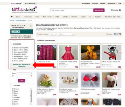
What These Split Test Results Mean:
Spending less time to achieve a desired result will almost always increase conversions. The less time it takes to navigate your website, the more time visitors will have to check out your products.
30. Changing the headline increased conversions by 5%
Meddelandelån Sverige AB offers quick loans online. They have a three step process that all applicants need to follow to be approved. They had an image slider that detailed what the process was but it wasn’t getting used.
Hypothesis: Having a more impactful headline for the image slider would get more visitors to use it.
Result: Conversion rate and average value per visitor increased by 5%.
Version A: Borrow 500Kr for free as a new customer
Version B (Winner): Small Internet Loans: Borrow money 7 days a week with clear pricing and honest terms
What These Split Test Results Mean: Your headline can make or break your product. Whether it’s on a landing page, article or in this case an image slider, make sure that people have a reason to keep reading.
31. Email focused on products rather than a story doubled purchases
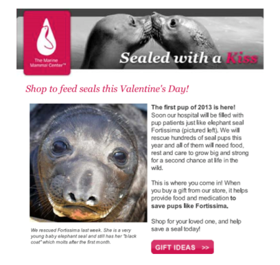
Marine Mammal Center is a hospital dedicated to helping injured seals. On their website they get funding through purchases and donations made in the gift shop. On Valentine’s Day they sent out two forms of email to see which would get a higher conversion.
Hypothesis: They wanted to see whether a story focused on the cause or on the products converted better.
Result : They found that the email focused on products (rather than a story) doubled the amount of purchases.
Version A (Story about seals):
Version B (Focused on products) – Winner:
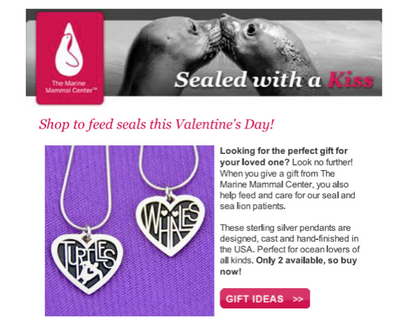
What These Split Test Results Mean:
When the goal of your campaign is to sell products you need to feature them. Although the story of the seal is heartfelt it doesn’t give any indication that they have products to sell.
32. Changing one form field increased completed forms by 8.66%
Newcastle School of Trades wanted to investigate why so many visitors abandoned their form at the field, “I am interested in…” Originally their drop-down menu featured 11 options with “undecided” at the end.
Hypothesis : If they move the “undecided” option to the top of the list they would increase the amount of people who complete the form.
Result : Changing the order of the one field increased conversions by 9%.
What These Split Test Results Mean:
Most of the people who filled out this form were undecided. Making the “undecided” field more prominent made it easier for visitors to fit into a category.
33. Donations increased by 114% by incorporating a video on email
David C. Cook is a non-profit organization that wanted to increase donations.
Hypothesis: Changing their marketing message from text to video would increase engagement and donations.
Result: Changing the messaging from text to video increased click throughs by 43% and donations by 114%.
Version A (Text):
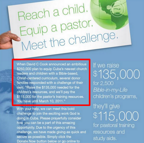
Version B (Video) – Winner:
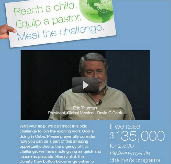
What These Split Test Results Mean:
A video is generally more engaging and can help you appear more credible. It also helps people put a face on a company. It makes it more personalized and ultimately will help your “Ask” be stronger.
34. 52% increase in bookings by changing form layout
Arenaturist.com is a website where visitors can book travel in Croatia.
Hypothesis: They wanted to see whether a horizontal or vertical form layout would get higher conversions.
Result: The vertical form layout increased conversions by 52%.
Version A (Horizontal version):
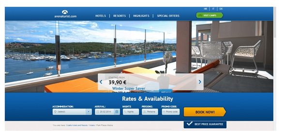
Version B (Vertical version) – Winner:
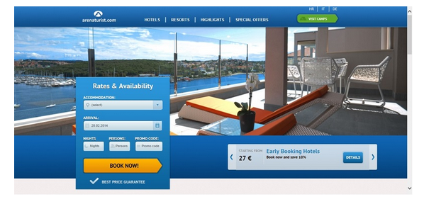
What These Split Test Results Mean:
If you have a long form (longer than 3 fields) use a vertical form. Vertically aligned forms are easier to follow and appear both less complicated and shorter.
35. Changing one word increased conversions by 139%!
GoCardless is one of the UKs leading online direct debit suppliers.
Hypothesis: They wanted to test whether changing “request” to “watch” would increase conversions.
Result: Changing one word in the CTA increased conversions by 139%.
Version A: The highlighted portion on the left says “Request a demo” and on the right “submit.”
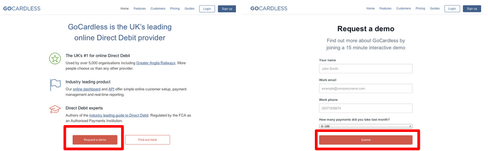
Version B – Winner: The variation now says “Watch a demo” on the left and “Watch” on the right:
What These Split Test Results Mean:
You need to constantly be looking for ways to reduce friction for visitors. If a visitor knows explicitly what will happen when they click your CTA they’ll be more likely to convert. Be as clear as possible about what your button is going to do. GoCardless increased conversions because more people watched their demo when they changed the text. This led to more people being interested in their product.
36. Writing out the word “MENU” increases unique clicks by 20%
Caffeine informer wanted to make it easier for users to navigate through their mobile site.
Hypothesis : They thought that if they got rid of the “ hamburger icon” and replaced it with the word “MENU” that more people would click.
Result : Spelling out “MENU” resulted in a 20% increase in unique visitors to other parts of their site.
Version A “hamburger icon”:

Version B “MENU” – Winner:
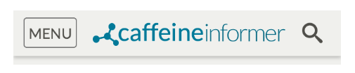
What These Split Test Results Mean:
Clarity is everything in site optimization. You want to really spell out what you’re offering your visitors.
37. Emotional copy increases conversions by 17.9%
JCD Repair offers a while-you-wait iPhone repair service. To increase the number of people that would schedule a repair for their phone they decided to test out new copy in their ads.
Hypothesis: Making the copy more engaging will increase the number of people who repair their phone.
Result: Variation 3 won and converted 17.9% better than the original with the following copy:
“Did Your iPhone Screen Have a Rough Night Out? We can’t cure a hangover, but we can make your iPhone look brand new in less than 1 hour. For half of what the other guys charge.”
Original (Clear Copy):
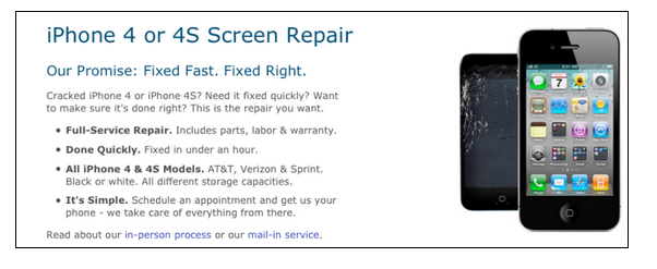
Version 1:
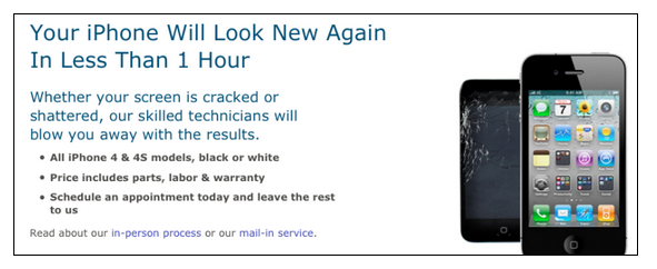
Version 2:
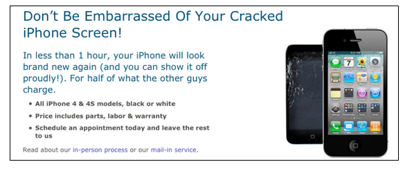
Version 3 – Winner:
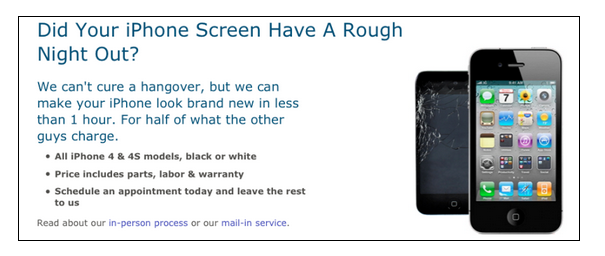
What These Split Test Results Mean:
While clarity is always important, you still need to be unique in how you present an offer. A dry offer is just that. Eliciting an emotional response can help increase your conversions. Version 3 was great because it probably made people laugh (I know I did.)
38. Minimal landing page design increases conversions
TheHOTH, a white label SEO company wanted to increase the number of businesses using their service. They had a good amount of traffic but their conversions were low.
Hypothesis : They wanted to see if by minimizing the amount of information on their homepage that they could generate more leads.
Result: Eliminating everything but the sign-up form took signups from 1.39% to 13.13%.
Version A
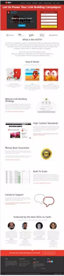
Version B (Winner) – Form only
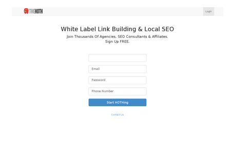
What These Split Test Results Mean:
This minimal design worked well for this website for a few reasons:
- Most visitors were referred – so they already knew about the company
- The focus was solely on signing up for an account
- Only one call-to-action (the original page had two above the fold + a video)
- The original form blended into the background
39. Increased conversions by 96% by keeping the message on the form consistent
Pink Pest Services wanted to increase the number of people requesting a quote for a bug terminator.
Hypothesis: They felt that by changing the copy and picture on the form conversions would increase.
Result: The form that solely offered a free quote increased conversions by 96% over the original.
Version A – Free Quote AND A special report (picture of book):
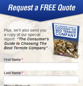
Version B – Free Quote only (picture of smiling man) – Winner:
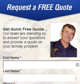
What These Split Test Results Mean:
Matching your body copy to your headline is extremely important. Version B worked so well because it kept talking about the free quote they would offer.
40. Changing copy of abandonment email increased conversion by 112%
Stride wanted to improve its abandonment email so more people would come back to their website.
Hypothesis: They thought that by changing the focus from “why Stride is so great” to “how Stride can help it’s customers” would increase the amount of people returning to the website.
Result: Focusing on the customer and what Stride could do for them improved conversions by 112%.
Version A:
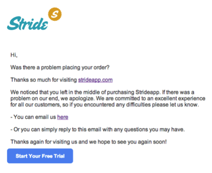
Version B:

Version C – Winner:
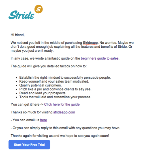
What These Split Test Results Mean:
In your abandonment email you always want to appear as helpful and informative as possible (without sounding too braggy.) Think of the abandonment email as a way to show what you can do for your customers. Give them a real reason why they would want to come back.
41. Providing more toolbar options increases donations by 181%
The Union Mission wanted to increase donations and recruit more volunteers.
Hypothesis: Splitting the one tab “Give” into two, “Donate” and “Ways to Give” would help increase donations and volunteers.
Result: Changing the one tab into two not only increased online giving by 181% but it increased their click-through rate by 300%.
Version A – “Give”:

Version B “donate” and “ways to give” – Winner:
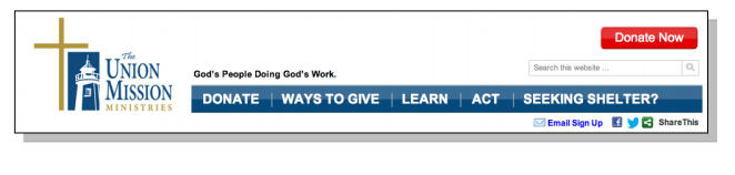
What These Split Test Results Mean:
Breaking “give” into two separate tabs makes it easier for visitors to know exactly what is wanted. They can now give by donating. Or, if they can’t donate money they can figure out other ways they can give.
42. A dedicated landing page increases conversions by 73%
TechInsurance.com specializes in re-selling insurance policies to the technical industry. Their main source of customers comes from Pay-Per-Click (PPC) ads. They originally had all of the traffic from their PPC ads directed toward their website and not a dedicated landing page.
Hypothesis: Sending PPC traffic to a designated landing page instead of their website would increase conversions.
Result: Sending PPC traffic to a landing page instead of their website increased conversions by 73%
Version A – Website

Version B – Landing Page – Winner:
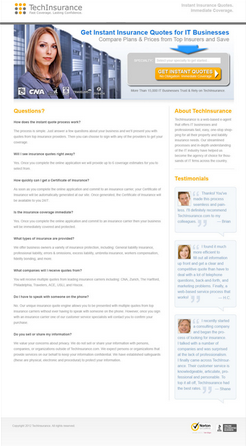
What These Split Test Results Mean:
43. 76% more people sign-up for free trial with newly designed pricing page
BigContacts.com wanted to increase the amount of people signing up for a free trial.
Hypothesis: Clarifying pricing options and emphasizing the free trial would increase signups.
Result: Changing the pricing portion of the page increased signups by 76%.
Version A:
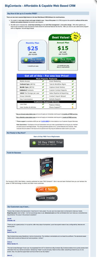
Version B – Clarified pricing options/emphasized free trial – Winner:

What These Split Test Results Mean:
If you’re offering a free trial make it obvious. No one can sign-up if they don’t know how to (or if they don’t know you offer it.)
44. Adding urgency increases conversions by 5%
Best of the Best runs competitions bi-weekly to give visitors a chance to win their dream car.
Originally they featured a countdown timer would reset each contest so visitors would always know when the competition was over/ the next one was.
Hypothesis: Adding in the countdown timer only three days before the competition would increase conversions.
Result: Putting the timer on the website with only 3 days left increased conversions by 5%.
What These Split Test Results Mean:
Adding a countdown timer is a great way to increase urgency as this encourages visitors to act on impulse. But if the end date is too far away then it’s not going to get anyone to act now because they’ll see they have a ton of time left. Make it as close to the end date as possible.
45. Lead generation increased by 200% by optimizing page layout
Equity Trust found that their current website design wasn’t converting visitors as well as they wanted.
Hypothesis: Making their website easier to follow through a redesign would increase leads.
Result: A redesigned and easy to follow page increased leads by 200%.
Version A – Original page:
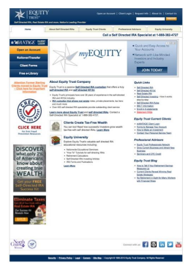
Version B – redesign – Winner:
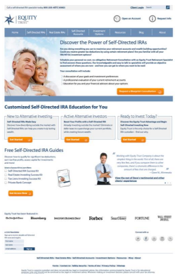
What These Split Test Results Mean:
The second page works better for a couple of reasons:
- It’s clear where the visitor needs to click with their bright orange CTA buttons (all of which lead to the same conversion goal.
- The image features their target demographic making it easier for visitors to relate.
46. Removing all distractions reduces cart abandonment by 11.40%
nameOn is a leading supplier in personalizing gifts with embroidery. They were looking to see if they could reduce the amount of cart abandonment. They felt that a major cause of the abandonment was because of the large number of distractions on the check-out page.
Hypothesis: Reducing the number of distractions on the check-out page would increase the number of successful checkouts.
Result: Reducing the amount of calls-to-action increased the amount of completed checkouts by 11.40%
Version A – 9 calls-to-action:

Version B – Reduced to two – “Welcome bonus” and “Continue to checkout” (Winner):
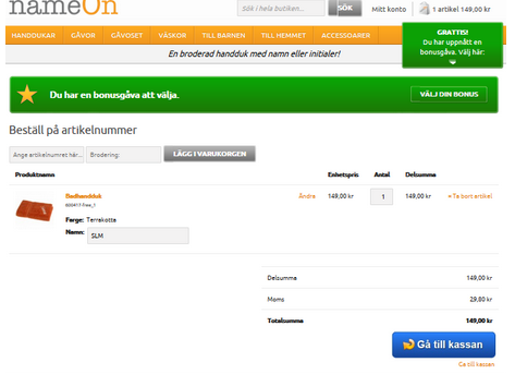
What These Split Test Results Mean:
The ultimate goal on your shopping cart is to get customers to complete the purchase. Don’t give your visitor an opportunity to leave their cart. There should ideally only be one call-to-action “Check out now.”
47. Optimizing their website for tablet increased revenue by 72
Shirtinator is an online store that sells customized textiles and gifts. They had two versions of their website. One for desktop and one for mobile. Any traffic that searched via their tablet was automatically shown the mobile version of the website.
Hypothesis: They wanted to see if showing users a new HTML-5 desktop version would increase tablet conversions.
Result: The new tablet friendly website outperformed the mobile website and increased revenue by 72%.
What These Split Test Results Mean:
Every year technology is going to change. As it changes you need to make sure that you’re optimizing your website based on what’s available.
48. Changing the background image increased signups by 38%
A dating website in Asia wanted to get more visitors to sign-up for a free trial. They knew that these leads could be easily converted to paying customers.
Hypothesis : Changing background image would increase the number of free trial sign-ups.
Result: Version C (Winner) had a background image that showed all types of people that were on the website. This increased signups by 38% and paying customers by 304%.
Version A:
Version B:

Version C (Winner):

What These Split Test Results Mean:
Version C showed the value of their dating site by showing the many options available. You always want to make sure that your background image is something your target audience wants.
49. 65% increase in revenue by emphasizing benefits on landing page
An invitation company was looking to optimize their landing page to increase revenue.
Hypothesis: Changing the copy to sell an experience (benefit) instead of the product (features) would help increase conversions.
Result: Selling an experience instead of the product increased sales by 65%.
Version A:
Version B (Winner):
Version C:

What These Split Test Results Mean:
You always want to make sure you’re selling the benefits of a product. You can say what the features are but if you want to sell you need to help people picture why it’s a great product for them.
50. Moving social share buttons above the fold increases Facebook shares by 490%
In 2013 Movember wanted to increase the number of registrants on their website.
Hypothesis: They felt that a redesign of their website would make it easier for people to register. One of the key things they did was move their social share buttons above the fold so registrants could share the message with their friends.
Result: By moving the social share buttons above the fold, Facebook shares increased by 490% and email shares increased by 75%
Their website – Originally the highlighted section was below the fold.

What These Split Test Results Mean:
Social sharing is a great way to increase awareness but if no one sees it, no one can share it. Making your most important information is easy to find is key to your success.
51. Boosted Conversion Rate by 26%
This is a no brainer. Even if it takes a little extra time to fill in an extra field, it most likely leads to higher physical and mental friction.
Neil Patel reduced the number of form fields at NeilPatel.com from four to three, for booking a consultation with me. This boosted my conversion rate by 26%.
I was asking for revenue information in the fourth field and I assume that many people didn’t want to share it.
Sometimes, you might need to increase the number of fields, so that you drive only qualified leads to your offer.
52. Humana
It might not seem much changed. But, as Design for Founders reports, “a simpler design plus a stronger CTA led to 433% more clickthroughs“.
The green button, the decluttered page and the changed copy of the CTA did their magic apparently.
Arono
Here’s one of the simplest a/b testing examples I came across, but effective too.
Syed Balkhi
We all know how important your free content is for your business. And getting your visitors to download it is easier than you may think. It might just even be a matter of color.
Like this button here that by becoming much more visible gained 28.7% more conversions.
Kiva
More information usually means more conversions. Kivi, a non-profit organization, got 11.5% more donations just by adding a F.A.Q. and providing statistics.
Conclusion
That concludes our massive A/B testing breakdown!
Hope you found some resourceful tricks and tips to optimize your next A/B Testing efforts.